Creating a Disruptive Visual Identity
The Challenge
Sports Interaction earned a reputation in Canada based on trust and reliability.
In 2022 the playing field had changed. Ontario started issuing new gaming licences and big competitors, primarily from the US were moving in and making their presence known by pouring money into bonusing and celebrity endorsement. We needed to do something different to highlight ourselves.
Our Competitors

What the Competition were Doing
They were spending a lot of money trying to “out sports bro” one another. Moody, darkened sports images and celebs pointing at phones were saturating Ontario. I noticed three key trends in Canadian sports betting.
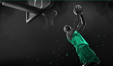
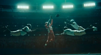
Trend 1: The Moody Sports Photo
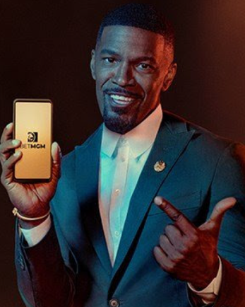
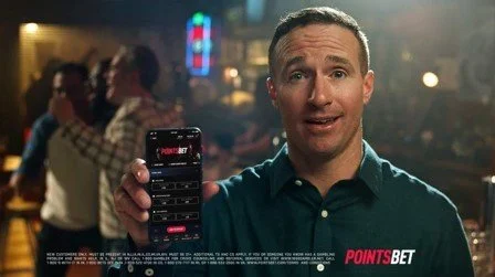
Trend 2: The Famous Guy With a Phone


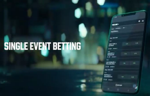
Trend 3: The BIG Phone


What Was Different About Us?
We knew Canada. We were established in the market. We had a unique product that had earned a reputation for being the easiest to use and the first choice for recreational bettors.
We were tailor-made for people in Canada looking to give betting a go, those people looking for fun rather than profit. Our product was perfect for this group. The challenge was in communicating that.
Disruption
Sports betting was quickly becoming a mainstream activity for Canadians. There was less need to sell the idea of sports betting. Now we were selling our way of sports betting, our personality. That personality was bright, easy, energetic and fun
The Creative Brief
I pulled together key colleagues in marketing and design and tasked them with a creative brief.
“Create a distinctive, refreshing graphic design style that stands out from the crowd”
Sounds great, right? Not so easy given how many restrictions we were working with.
Legal Restrictions:
Do not use the likeness of any known sports player.
No team or league logos.
Fulfil legal obligations to include responsible gaming text in ads.
We must very clearly NOT be marketing to underage people.
Additional Restrictions I Set:
Do not try to pass stock images off as real players.
We must look like we’re selling a sports product
We must stand out amongst competitors.
The graphic design style must be sufficiently distinct to be recognised without logo accompaniment.
Repetition reinforces our brand but it can get boring. The style should have consistent elements but many branches. We will have multiple promotions, sports and features sharing space that need to be distinct from one another.
Practical Considerations:
We are working with tiny banner ads all the way up to billboards. The style must work across all sizes.
The style will carry through to the product. If we’re promising a fun look we want to deliver on that.
We will want to animate, scale in the future. Use a style that can be published as a vector image.
Use a style that can be worked on as a team. We want to avoid dependency on any individual.
Step-by-step
I had set a substantial but not unreasonable challenge for the team. Here’s how we broke down the work:
Colours and Textures
We had a set of core palette colours that we were sticking with.
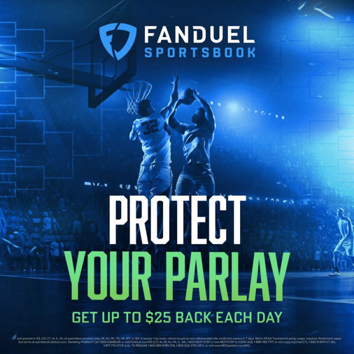
I wanted to introduce some brights to use for highlights and distinction. We used a texture - a geometric pattern that was an existing motif within the product. The team did not disappoint. The creative mood was positive. The colours reflected that.


We had a strong ‘S’ shape in our logo. There was something unique to this. We wanted to be big, bright and bold. We took this S and did that.
Testing out the brights as geometric layers got us excited about how these might animate in the future. Movement is implied, even in a static piece.

Typographic Treatment
Often we rely on typography to get our message across. It has to make a statement on its own.
The background implies a sporty, moving feel.
The font is ‘Montserrat’. It is strong, simple and works great at different weights.
A/B testing showed us that highlighting the amount of the bonus rather than the percentage worked best.


Typographic Treatment in-situ
Images
These represented the greatest challenge but presented the greatest opportunity. We could stand out from the competition by doing something unique to us.

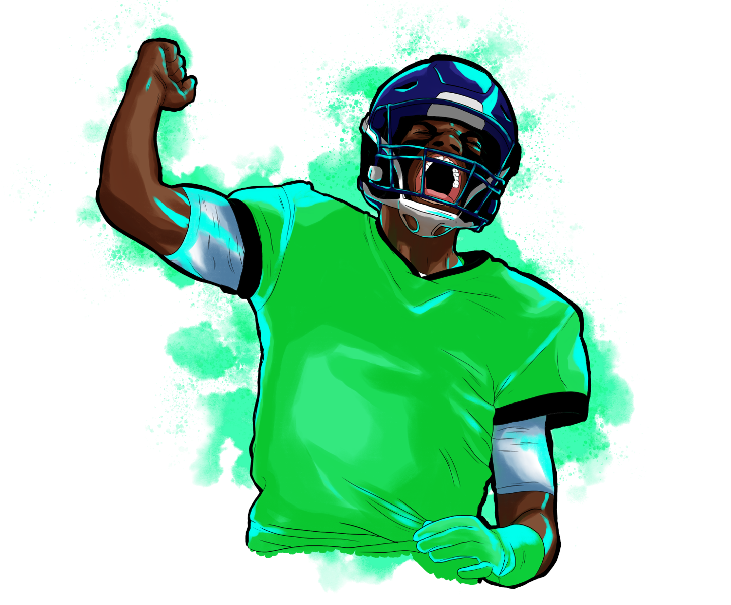
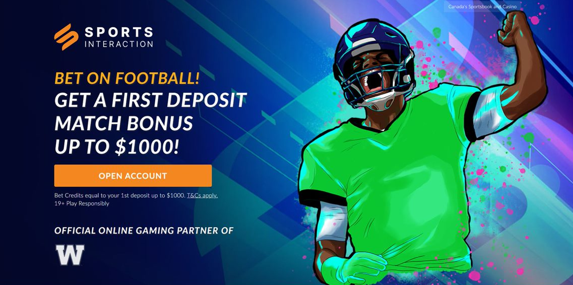
We created a unique illustration style. It is based on real-world action photos but the level of abstraction allows us to get more expressive with colour and movement. We would focus on the face to show emotion and human connection. The designer can change out facial features for greater expressiveness and impact.
The images are created in parts that can be switched out to make different poses and apply different colours.
The images can also be scaled so that they can be reused for different applications. For a stronger effect we enlarged the illustration in relation to the background. The pose would convey energy and movement
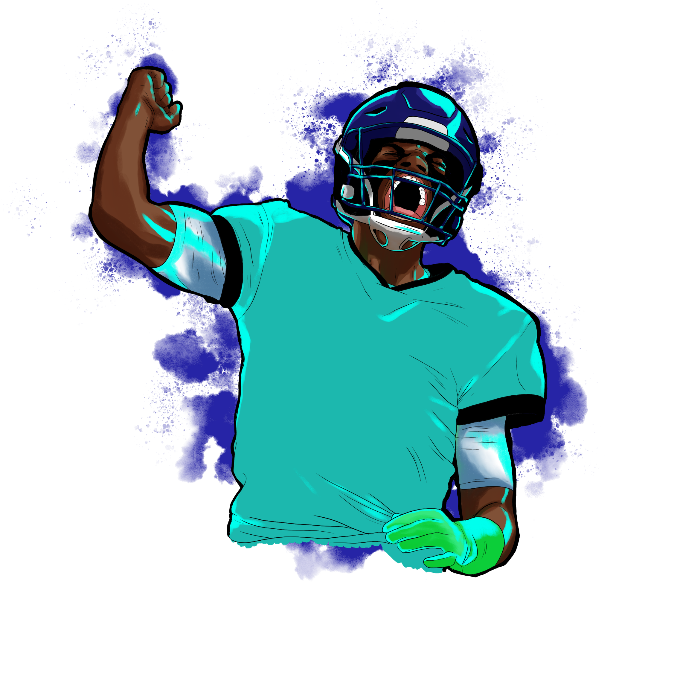
When we want to add extra energy, we can use middle-ground enhancements – confetti, fireworks, dust, paint splashes.

Bringing it All Together
All the pieces came together to create a visual identity that was uniquely ours, flexible in application and shouted out for a fun, energetic brand.
Takeaways
Design and Marketing Collaboration is Greater Than the Sum of Their Parts.
This was a super-powered collaboration. On one side we had market research, awareness of the market and historic behaviour trends of our customers. On the other we had creativity, experience and knowledge of what will work across web, mobile, TV and real-world. These combined to disrupt a tired advertising environment to burst through for the winning score.
Designing for everything is difficult
The design brief I set ran from tiny banner ads to social media to landing pages and, eventually, to giant billboards, which was a lot to take on board. Making sure that meeting one need doesn’t take from the needs of the other is something that only comes with the experience I had on the team.
Recognition-Style Leadership Works
My team had a new marketing colleague who brought energy and advertising experience. We had a graphic designer with UI experience who had a vision of how we could future-proof our work for animation. We had a talented illustrator whom I encouraged to share his skills with the team. My greatest contribution to the project was to recognise that these different and diverse skills existed and to help combine them to bring out the best for themselves, the team, the product and the customer.